Supercharge your digital presence with our website design services.


User-friendly and engaging website for a blockchain analytics platform
Brand
Location
Clutch Review
Client
Budget
Industry
- SaaS
- Technology
- Web3
Environment
- Next.js
- Sanity
Release
Live
Check livePROBLEM
SOLUTION
VALUE DELIVERED
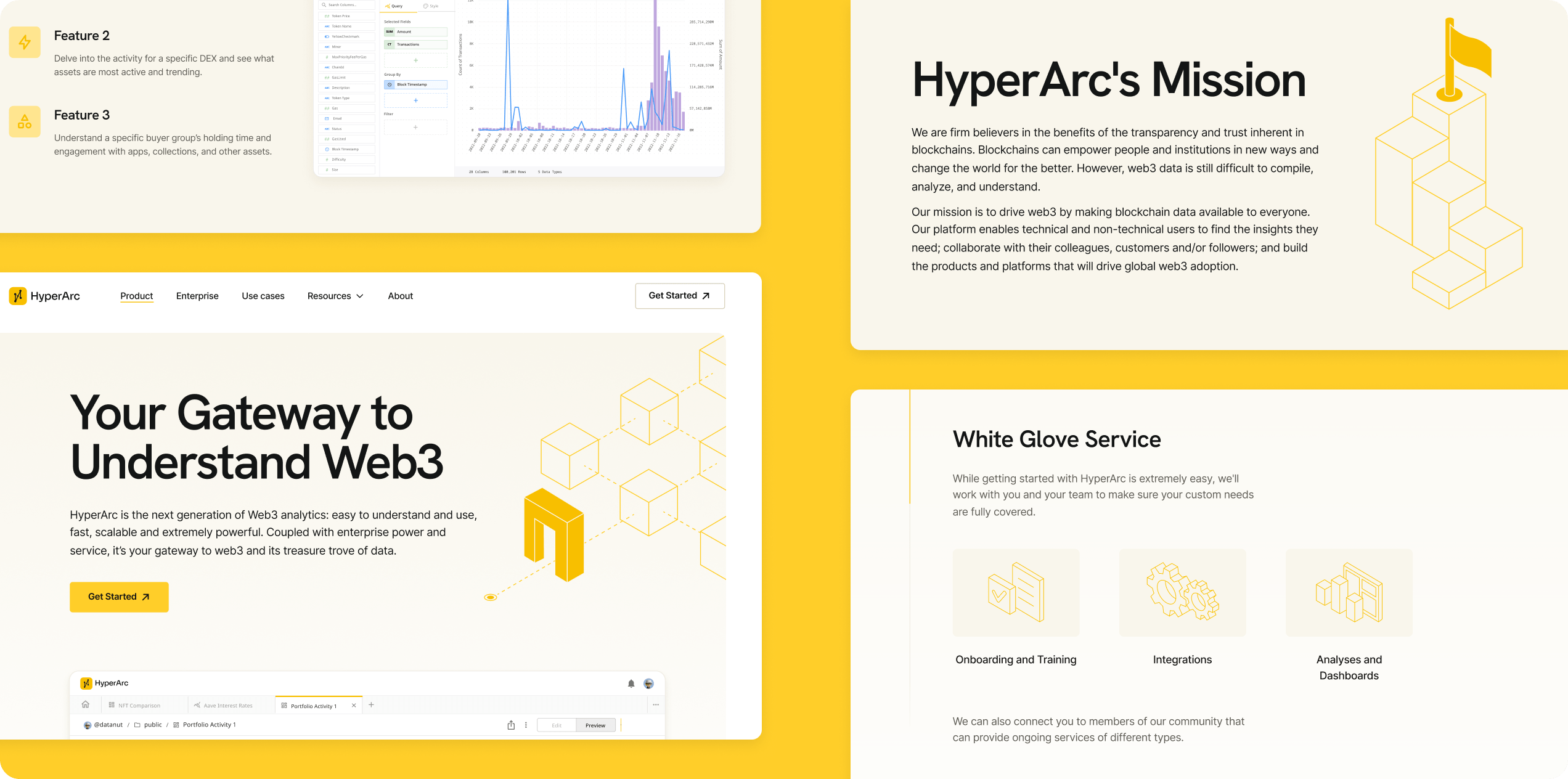
ABOUT THE CLIENT
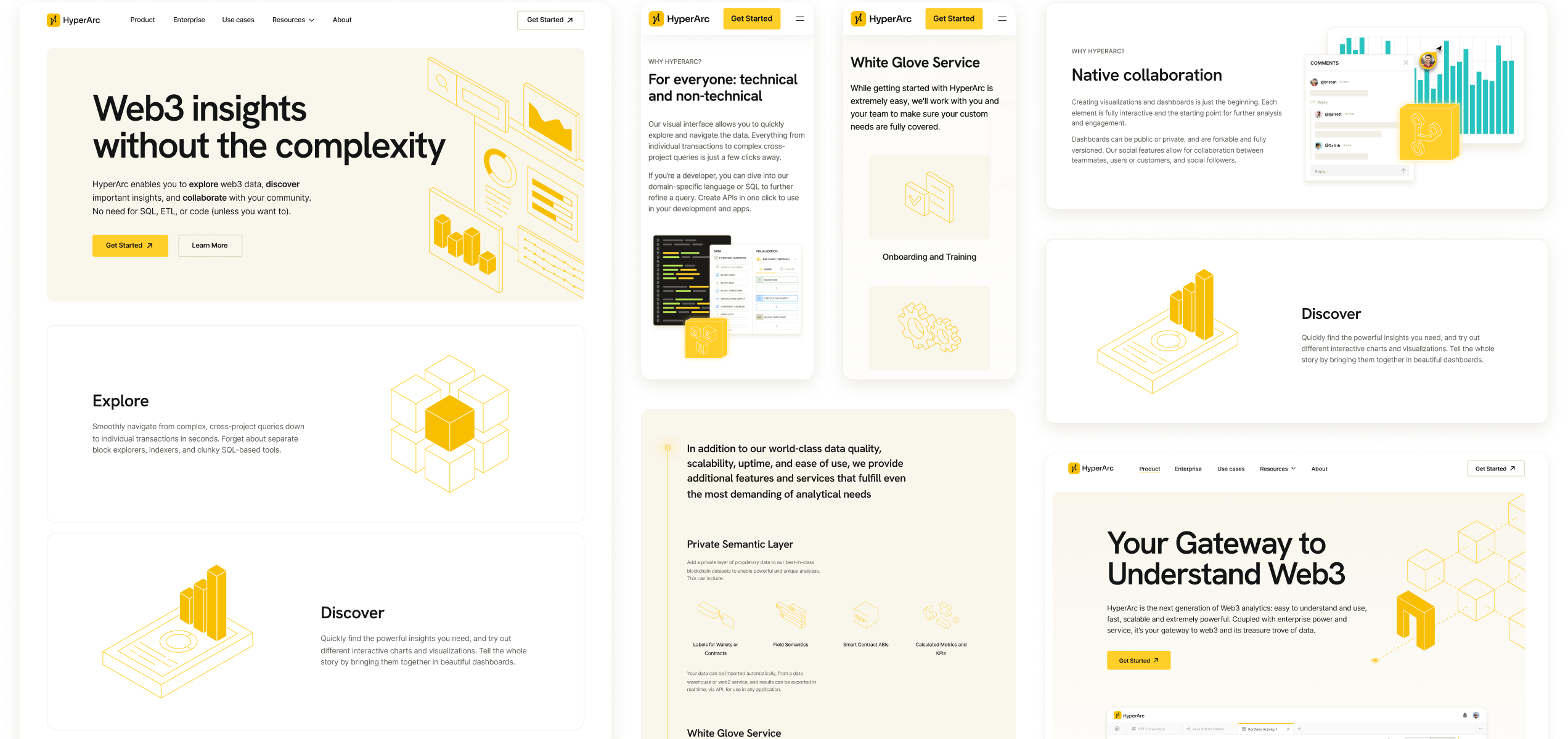
Experts in blockchain analytics
HyperArc makes it easier for anyone, whether it be a hobbyist or a developer, to explore blockchain data. The platform combines no-code development, top-quality user experience, and world-class analytics, setting the standard for usability, performance, and interactivity in the blockchain technology sector.
ABOUT THE PROJECT
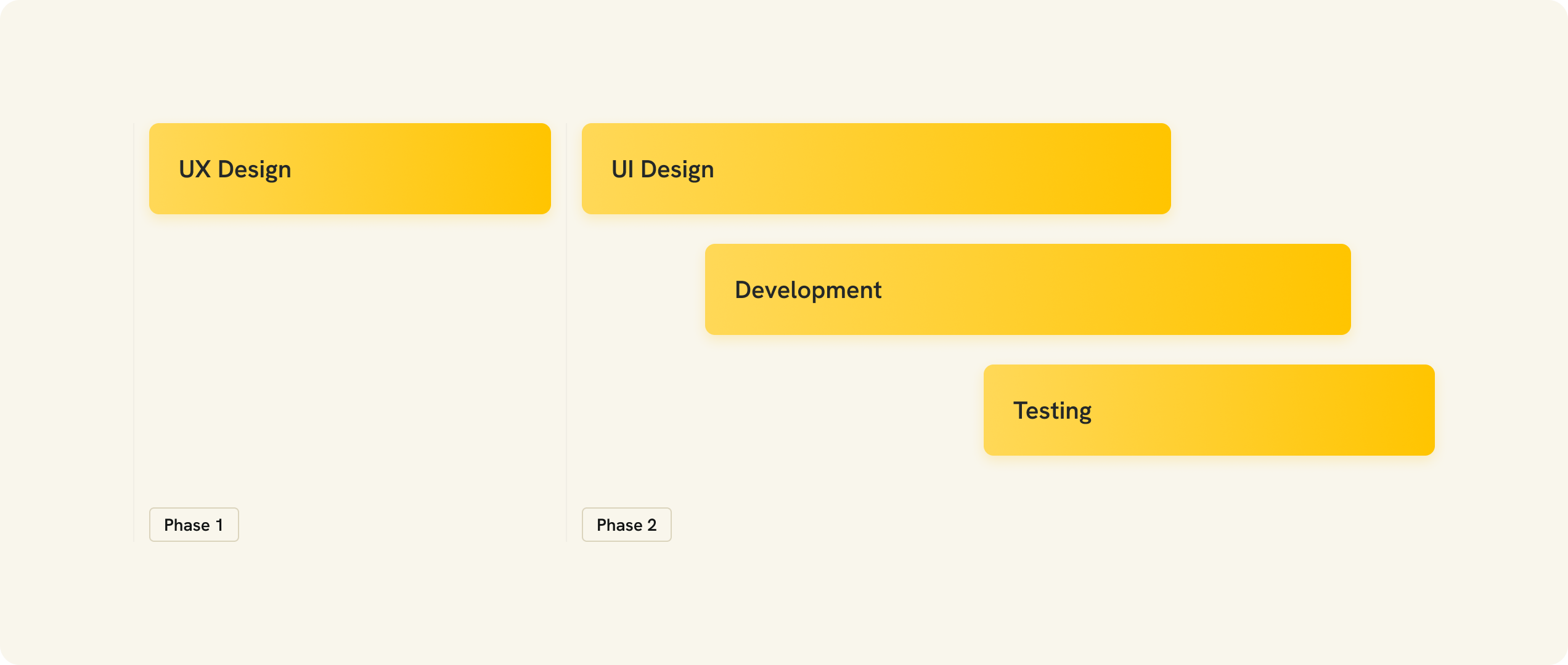
Project timeline
The project timeline encompassed a wide range of tasks. We started with user experience and user interface design. Then, we moved on to front-end development and quality assurance.
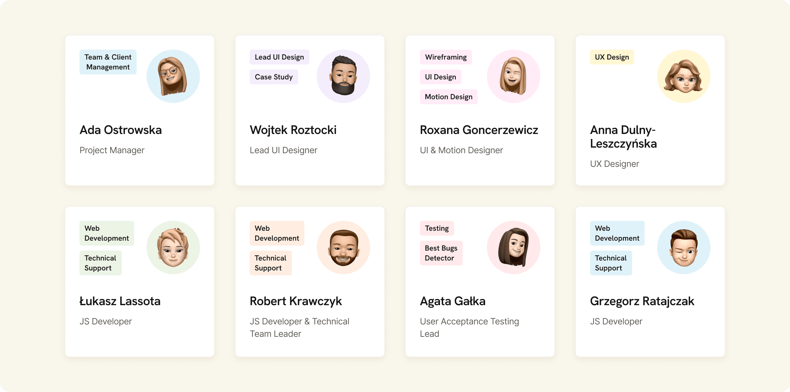
PROJECT TEAM
Talent and expertise combined
We put together a team of talented and experienced individuals. It included a project manager, two designers, three developers, and a quality assurance specialist.
HOME PAGE
Modern and memorable
The home page was meant to help the Client achieve two different goals. First, it had to grab the attention of potential clients. Second, it was supposed to show them what the Client's product does and what its benefits are.
PRODUCT PAGE
Showcasing unique selling points
The product page shows what our Client's platform is about. It outlines its key features, as well as a few reasons why it's worth using. Aside from that, the visitor can go through it to check what the platform is commonly used for.
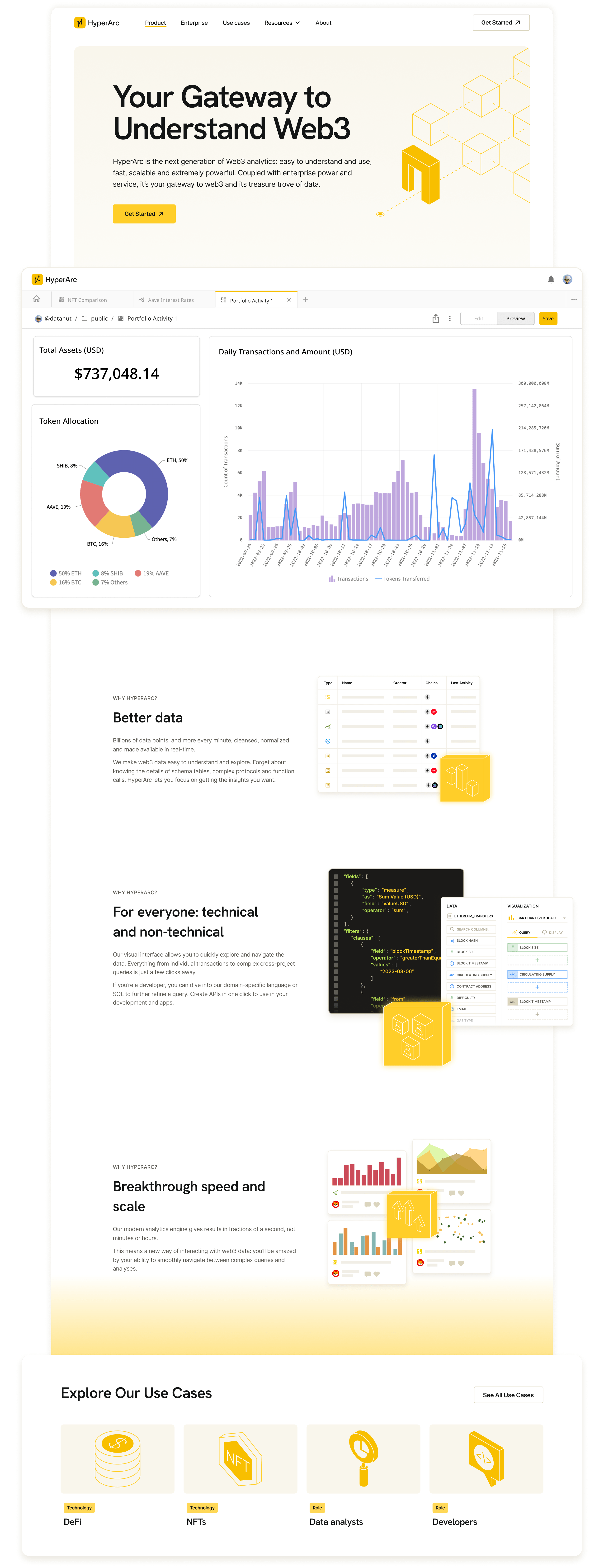
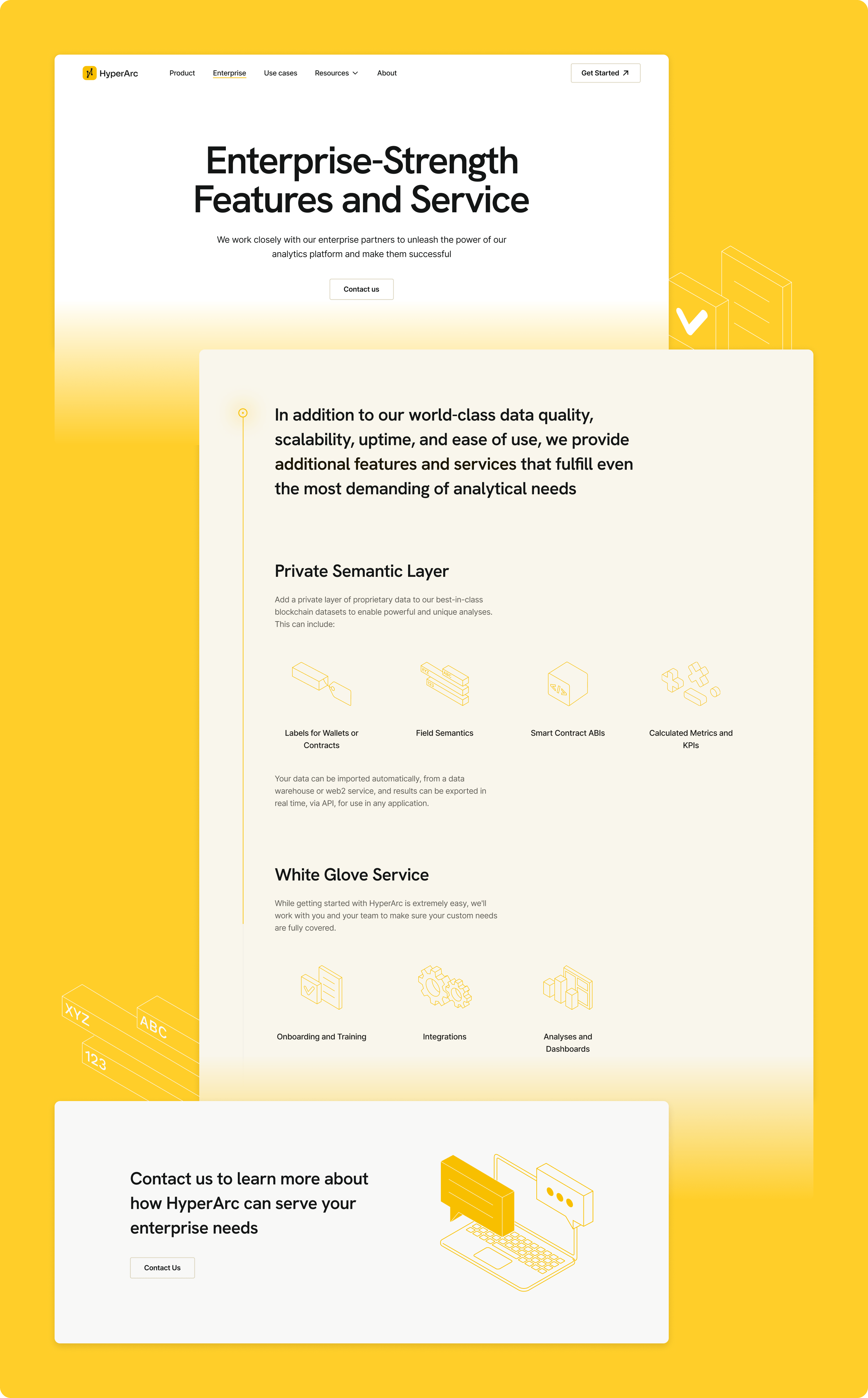
ENTERPRISE PAGE
Catering to big business needs
We equipped the website with a separate section dedicated to enterprise clients. It's centered around the ways in which our Client can cater to the needs of such clients, with an emphasis on data security and flexbility.
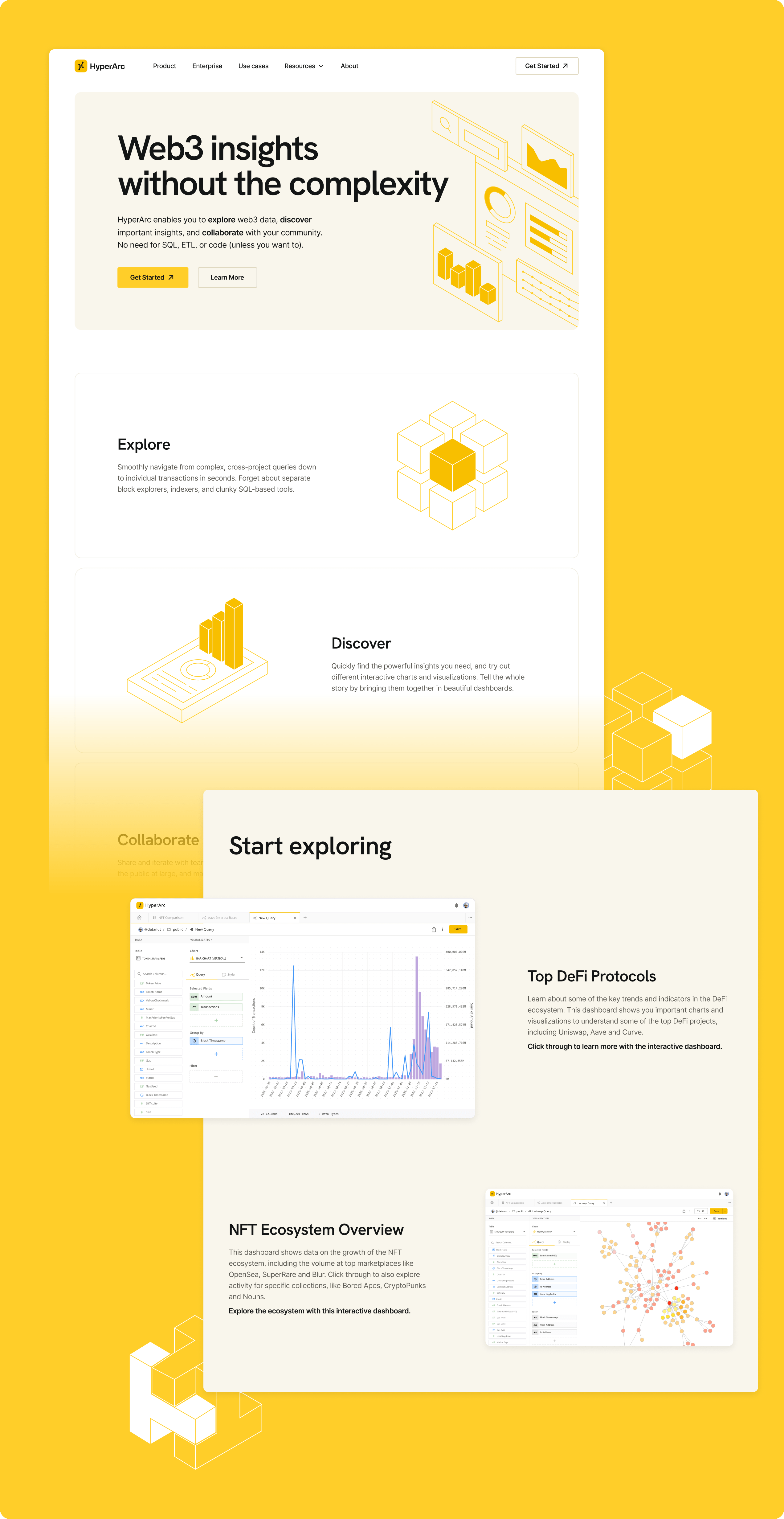
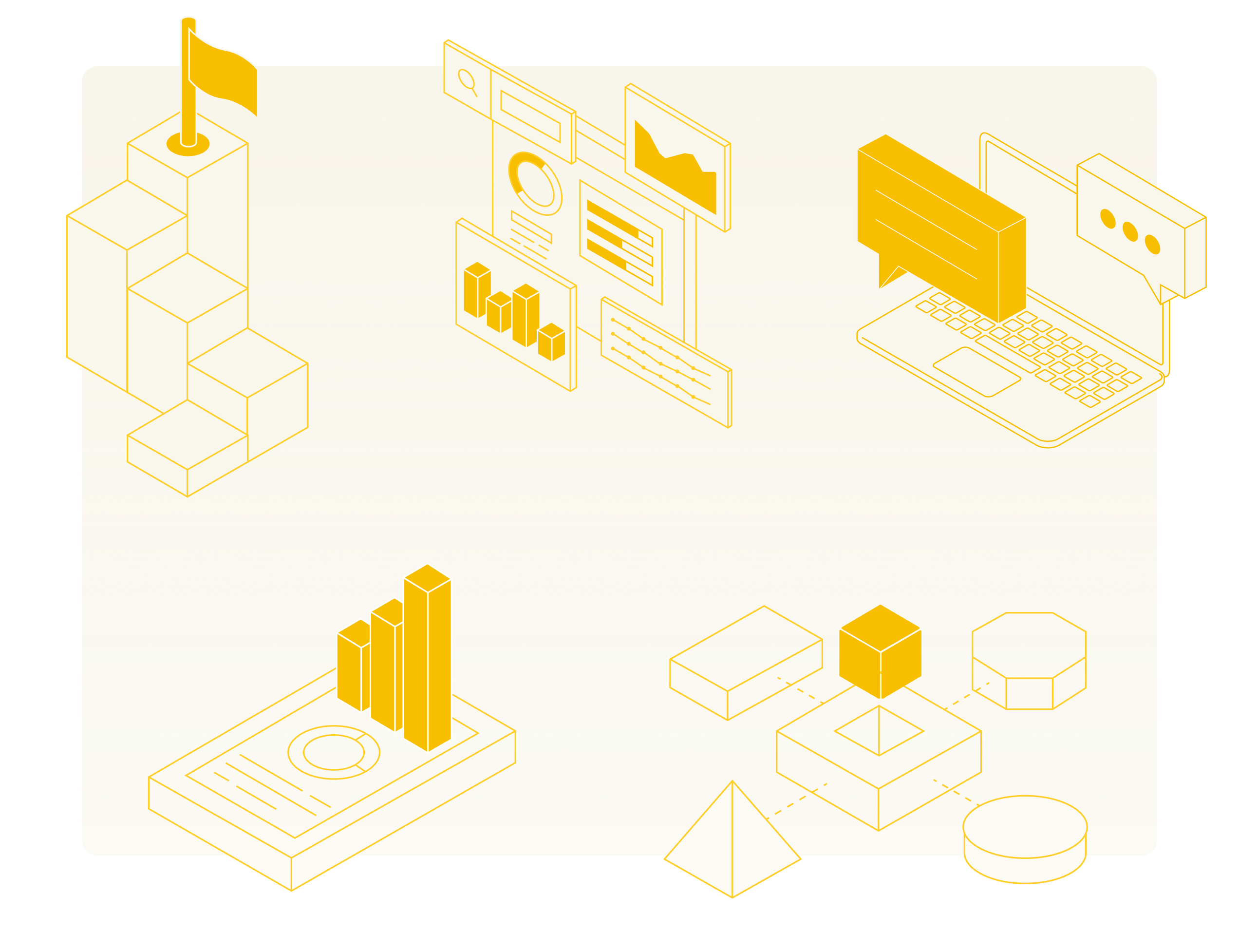
GRAPHIC DESIGN
Isometric illustrations
Our Client wanted the website to be unique and attention-grabbing. With that in mind, our designers created a number of isometric illustrations, which add a touch of artistic flair to the design. We then brought these illustrations to life using subtle animations, resulting in an immersive and dynamic user experience.
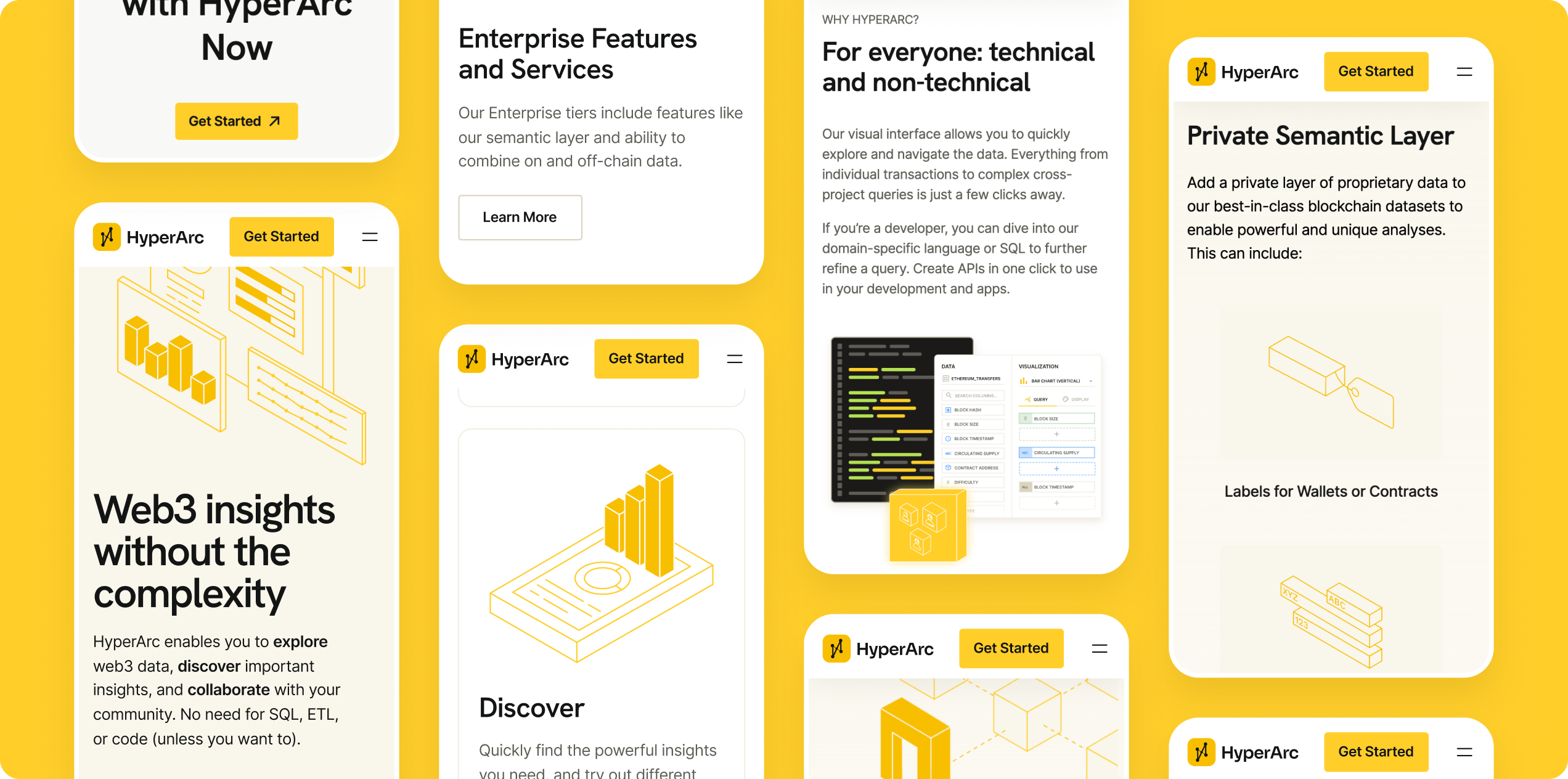
MOBILE DESIGN
Data analysis on the go
When it comes to the mobile version of the website, we did our best to make it easy to navigate. By keeping mobile design principles in mind, we were able to make the website's functionality and visual appeal consistent across a wide range of different mobile devices.
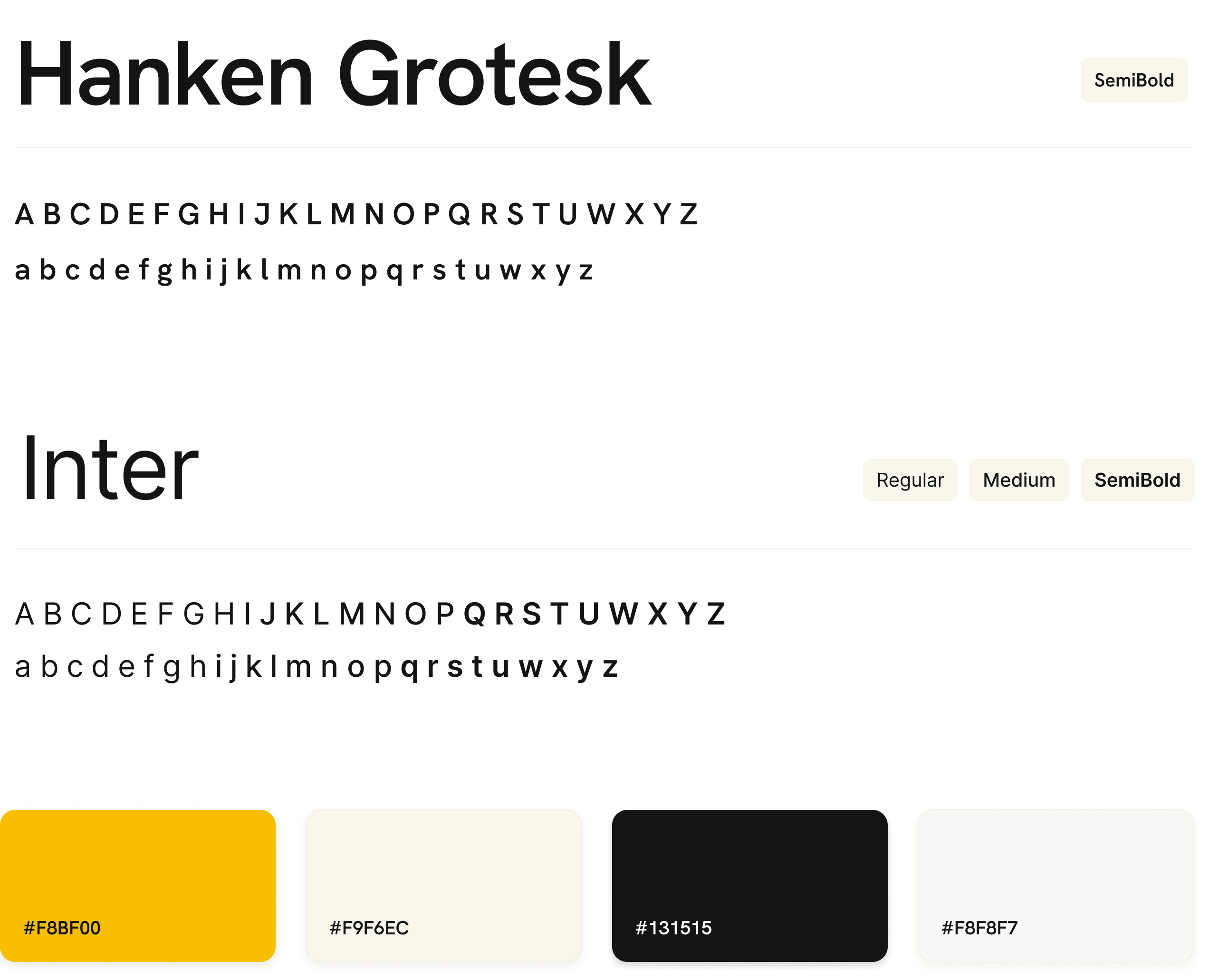
BRANDING
Clean, unique, and innovative
We made use of a combination of the Hanken Grotest font and the Inter font. They are both clean and readable, but also convey a sense of innovation and sophistication. With the added color combination of black and yellow, the website is perfectly aligned with the Client's identity. It symbolizes a fusion of cutting-edge technology and data-driven insights, both of which are at the core of their product.
Adchitects always delivered on time and on a steady and reliable cadence. Project management was very responsive and highly organized.
Department Head
HyperArc
ARE YOU READY?
Let’s build your next digital product