Supercharge your digital presence with our website design services.


Attractive website and brand identity for a provider of online coaching
Brand
Location
Clutch Review
Client
Budget
Industry
- Education
Environment
- React.js
- Vercel
Release
Live
Check livePROBLEM
SOLUTION
VALUE DELIVERED
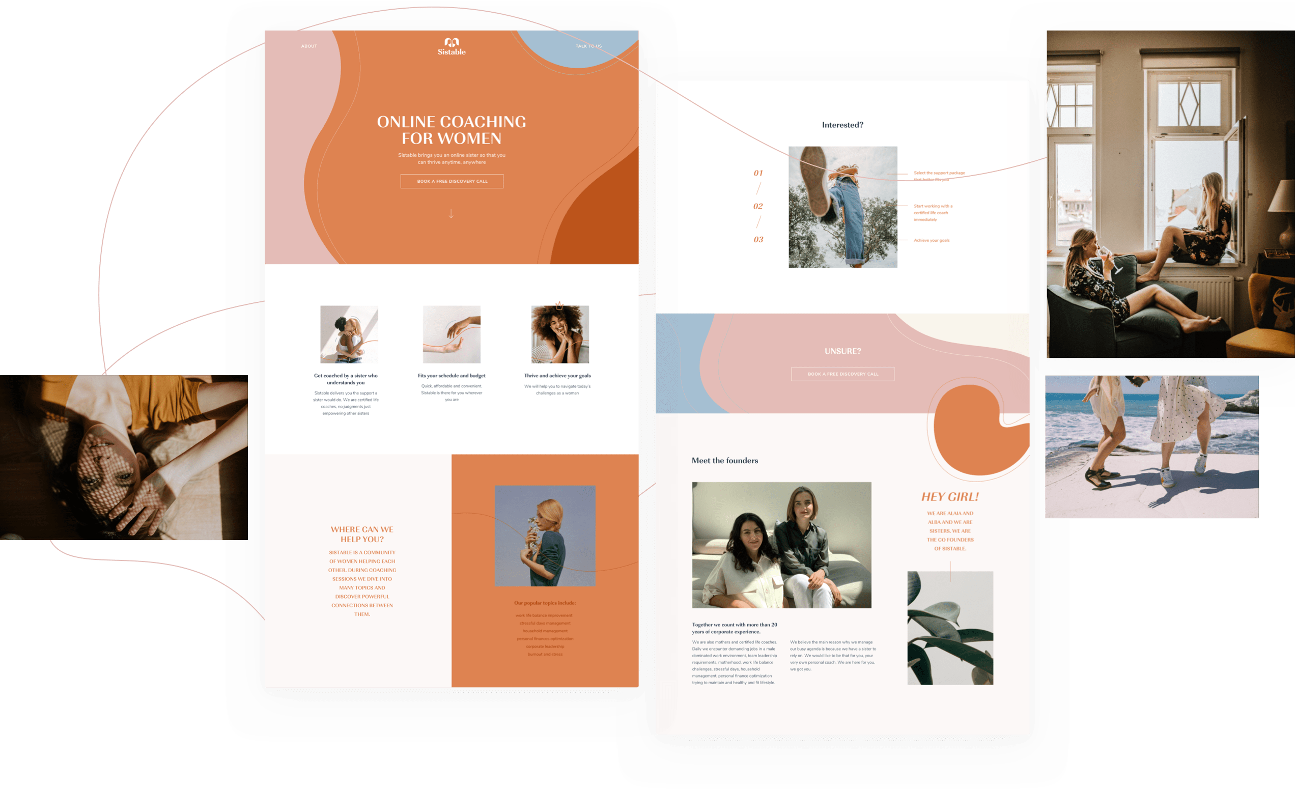
HOME PAGE
Inviting growth
Visiting Sistable's homepage feels akin to receiving a comforting embrace from a friend, coupled with an encouraging nudge towards personal growth. The use of a warm color palette crafts an atmosphere of welcome and support, enhancing the brand's visual narrative. The inviting ambiance is further accentuated by a distinct value proposition and a compelling call to action, leading users towards scheduling a complimentary discovery session.
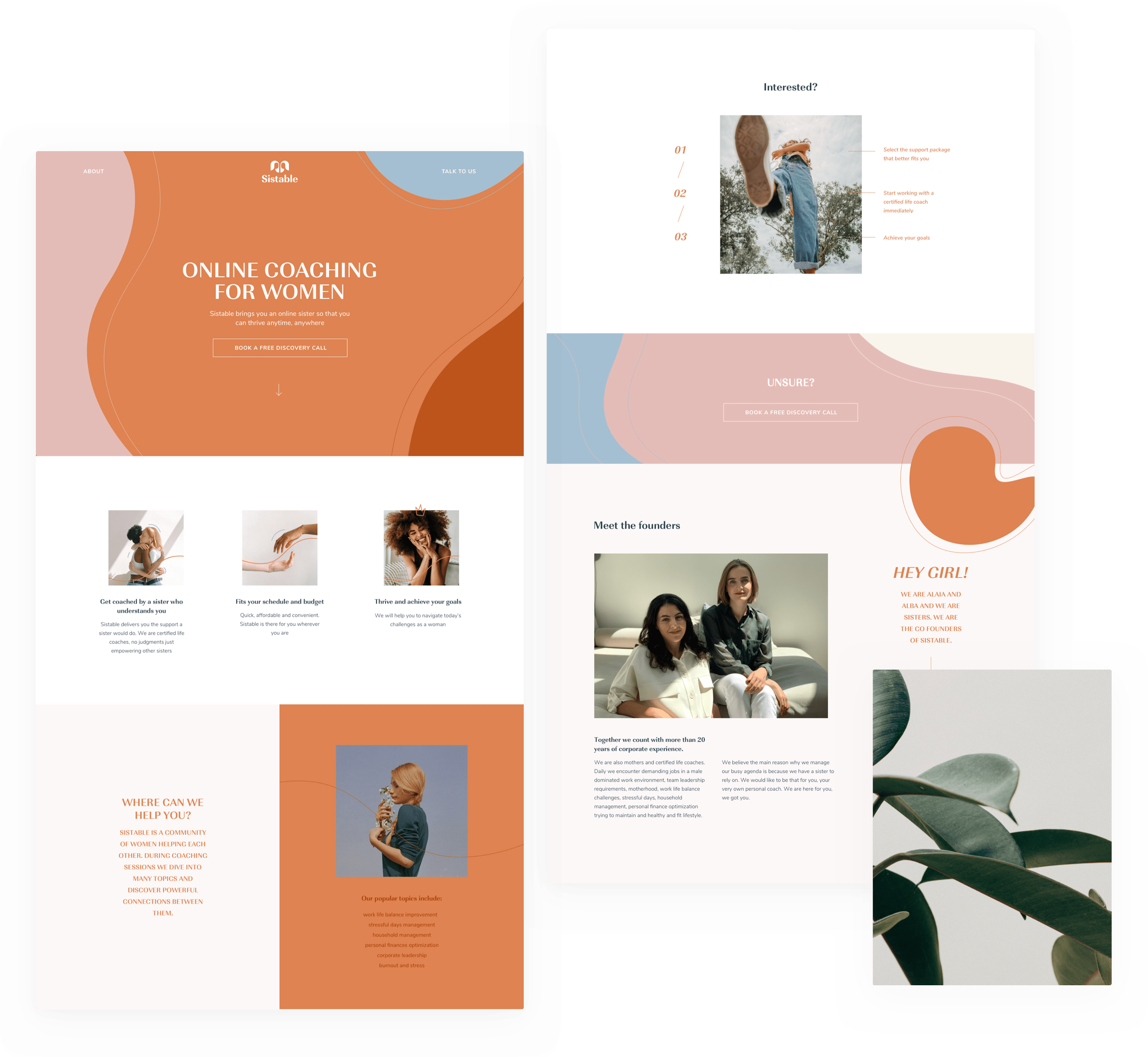
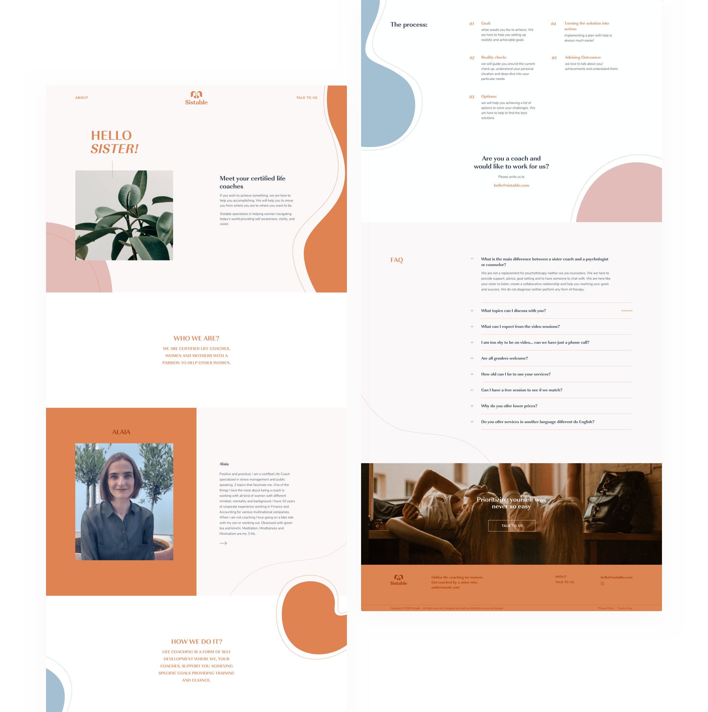
TEAM & FAQ
Building trust
Introducing users to the team behind a product is a strategic move for any emerging brand, as showcasing real faces can significantly bolster trust among the audience. With that in mind, we incorporated a section on the website dedicated to the people powering the Sistable brand. To address any lingering uncertainties, we also integrated a detailed and user-friendly section with a list of frequently asked questions.
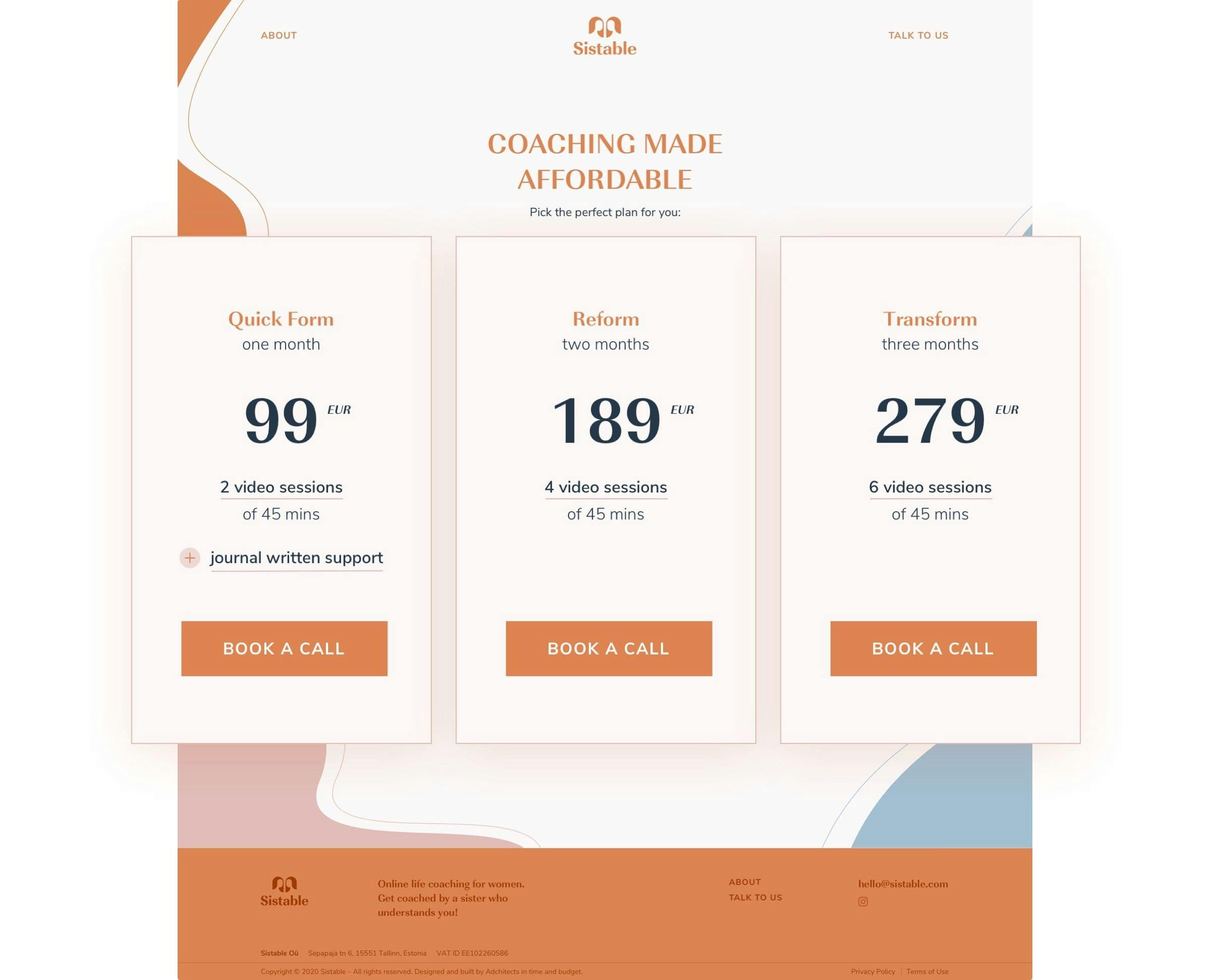
TRANSPARENCY
Clear prices, easy scheduling
Understanding that customers appreciate straightforwardness, we designed Sistable's pricing and booking page with an emphasis on transparency and ease of access to information. The layout is intuitive, making it simple for users to grasp the pricing and services offered. Booking an appointment is hassle-free, with no small print or hidden fees. It's an approach that ensures a smooth, user-friendly experience, fostering trust and satisfaction.
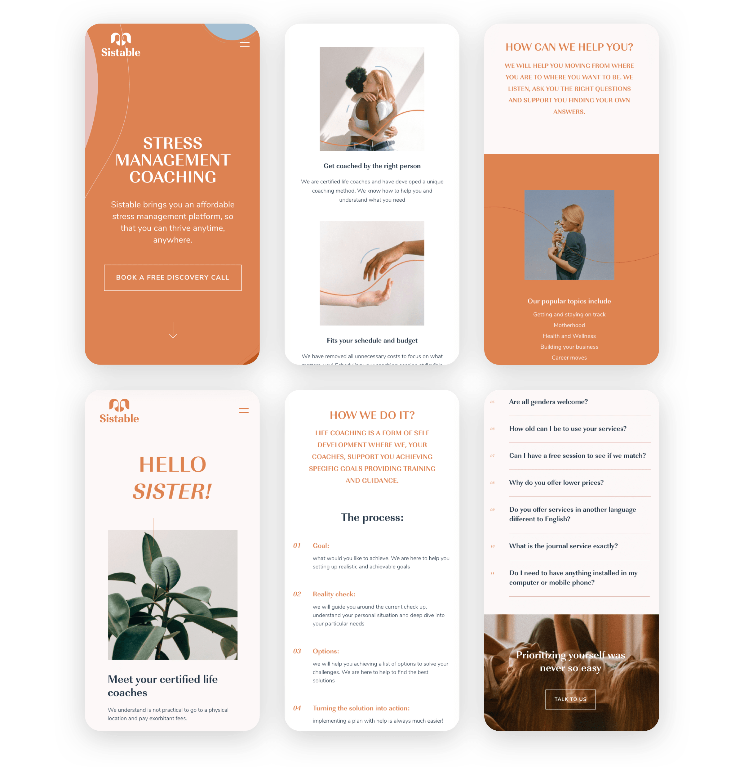
MOBILE DESIGN
Accessible anywhere, anytime
Sistable stands as a reliable support system, accessible around the clock and from any device. Whether you're reaching out from a mobile device or from a desktop computer, Sistable ensures that the functionality and visual appeal of the experience remain uncompromised, providing seamless access to support whenever and wherever you need it.
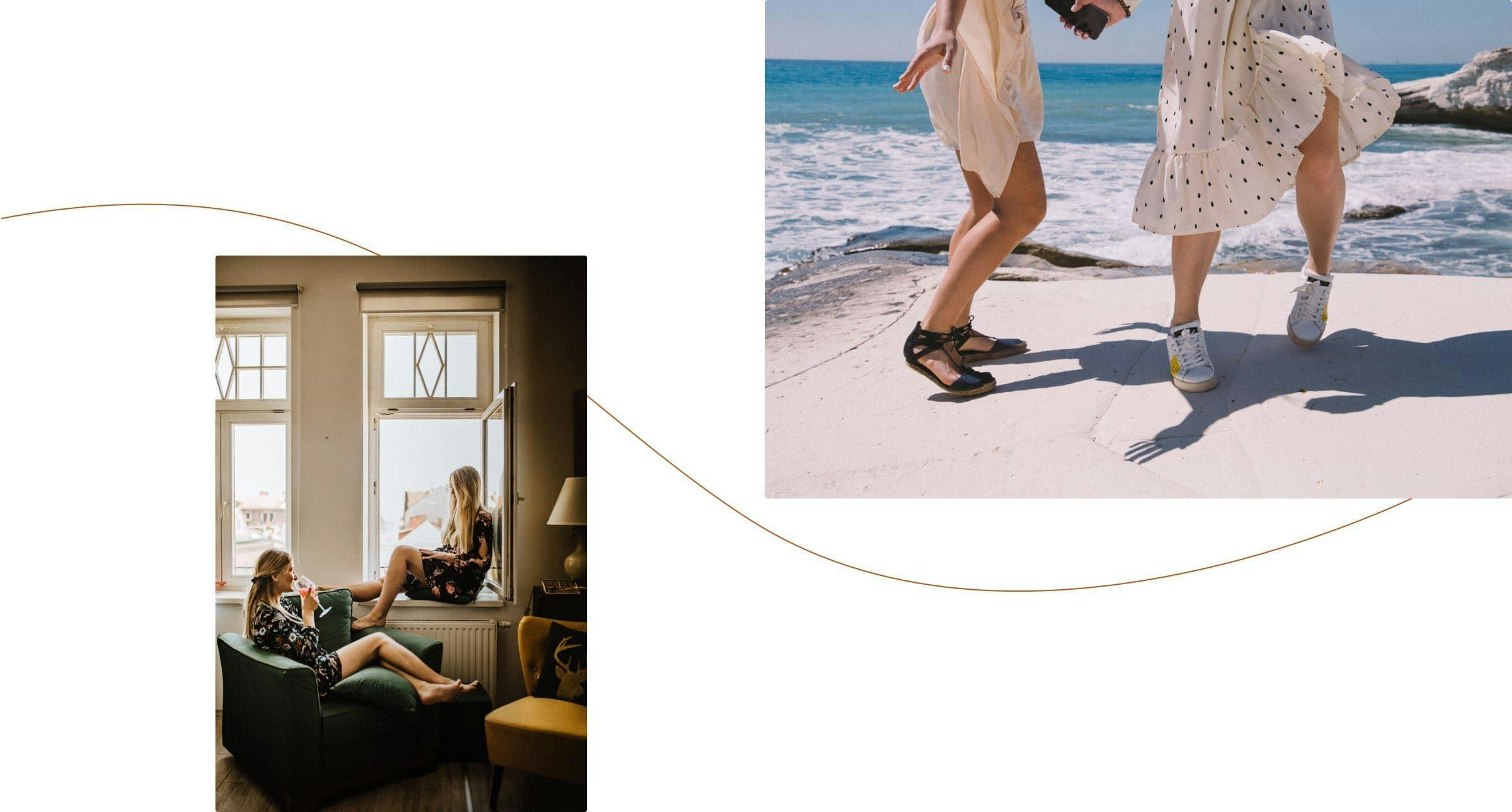
PHOTOGRAPHY
Strength, beauty, independence
The essence of sisterhood is perfectly encapsulated through a curated selection of images showcasing strong, beautiful, and independent women. We carefully chose photographs that exude power and femininity, reflecting Sistable's brand identity of intimacy, warmth, and community.
BRAND IDENTITY
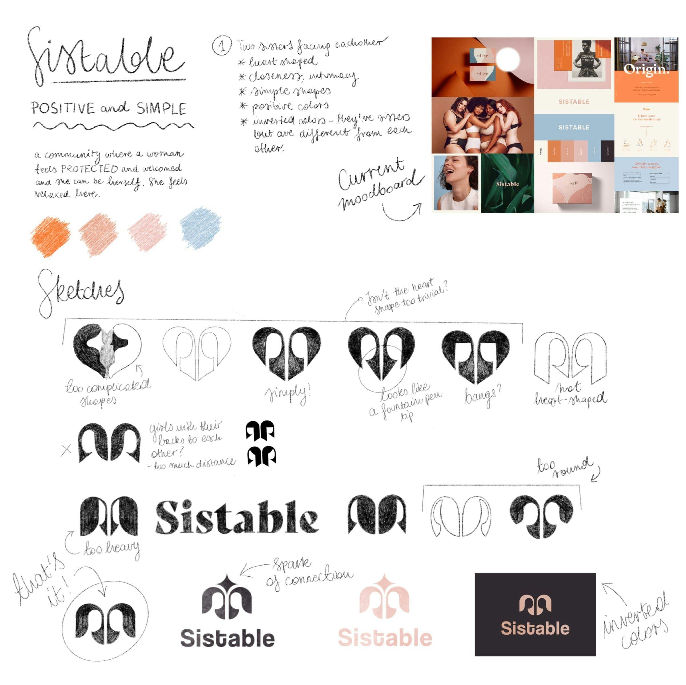
From concept to reality
Crafting a brand's visual identity demands a high level of responsibility and precision. To encapsulate the brand story and vision accurately, a prolonged phase of ideation and development was undertaken. Through a detailed and exploratory process, evident in the drawings shared below, the journey culminated in the realization of an ideal design that truly reflects the brand's essence.
BRAND IDENTITY
Unity in design
Where did the intricate yet fulfilling design journey conclude? The culmination is visible in the final logo design. It's a symmetrical emblem depicting two sisters, with the brand name prominently displayed beneath. It not only captures the essence of unity and support, but also ensures immediate brand recognition.
TYPOGRAPHY
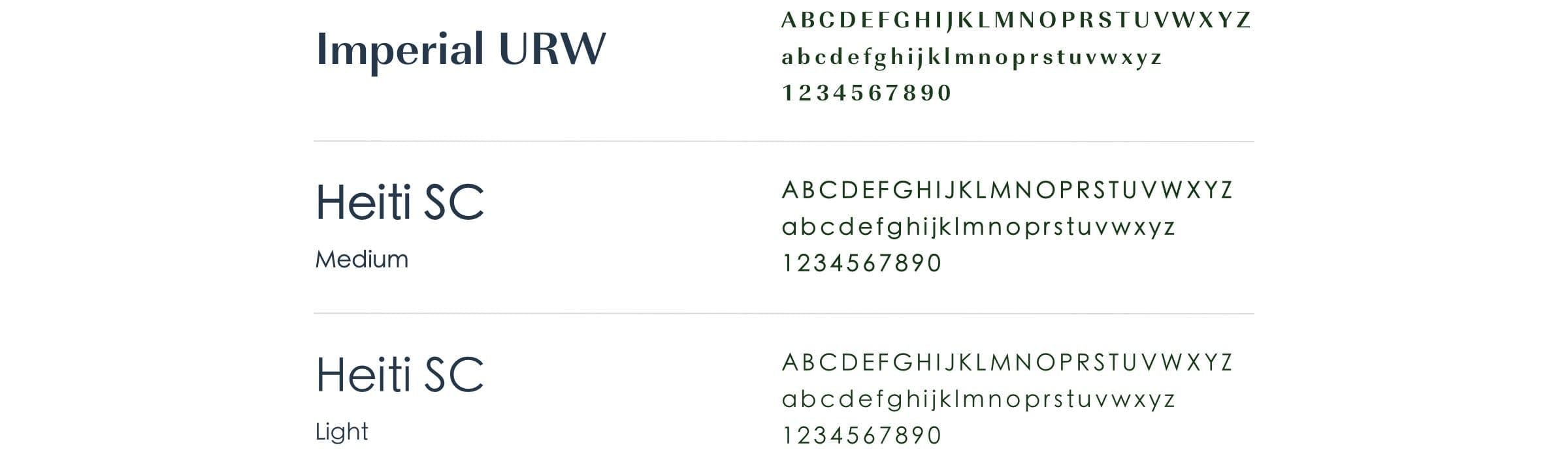
Typographic unity
The concept of pairing, much like the unity of two sisters, was mirrored in our typographic strategy by blending two distinct typefaces. One is dedicated to headings and the other to subheadings and body text. It allowed us to achieve a design that is both harmonious and balanced.
COLOR PALETTE
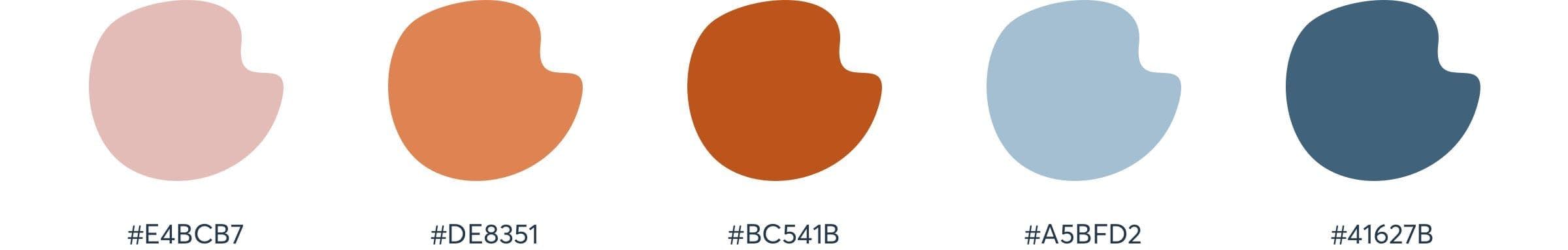
Colorful complexity
Is it possible to discover the ideal color palette for a brand that embodies both femininity and strength, vulnerability and resilience? We believe we've achieved just that! The harmonious blend of warm pastels with rich, deep blue tones effectively showcases the brand's multifaceted nature in a visually striking way.
Everything was finished on time, and I would say in fairly impressive time.
Alaia Calleja
CO-FOUNDER - SISTABLE (EE)
ARE YOU READY?
Let’s build your next digital product